Thursday

La Jetee Chris Marker

La Jetee is a film made by Chris Marker, Constructed almost entirely from still photos, it tells the story of a post-nuclear war experiment in time travel. The film runs for 28 minutes and is in black and white. It won the Prix Jean Vigo for short film.

The 1995 science fiction film 12 Monkeys was inspired by, and takes several concepts directly from, La Jetée. [1]

[1]Wikipeida. (2011). La Jetee. Available: http://en.wikipedia.org/wiki/La_Jet%C3%A9e. Last accessed 2013.

Above is the full film

Walter Benjamin

Walter Benjamin

Walter Benjamin (1892-1940), was born in Berlin on July 15, 1892. He was an unusual figure in 20th century thought, considering himself a "Man of Letters" and a literary critic rather than taking the more illustrious title of philosopher. His short career carried him through the ten years leading up to WWII, publishing an essay on Goethe's Elective Affinities in 1924 that earned him swift recognition. He had received his doctorate in Switzerland in 1919, but failed to acquire his habilitation, making it difficult for him to find work well suited to his abilities. The work he had submitted in 1928 was the only full-length study that he published,The Origins of German Tragic Drama, and it was likely misunderstood by its jurors, for it prominently contained a complex network of appropriated quotations. [1]

[1] The European Graduate School. (2010). WALTER BENJAMIN - BIOGRAPHY. Available: http://www.egs.edu/library/walter-benjamin/biography/. Last accessed 2013.


Jeremy Deller- Acid Brass

 I looked at Jeremy Deller earlier in the blog when looking at mapping, as he created a map  cover for the tube map, this still links in with maps in a way.

Jeremy Deller is perhaps most famous for his recreation of one of the most powerful moments of the Miners Strike in 1984, the Battle of Orgreave. But, it's to another piece of inspired performance work that he is pointing with his giant wall drawing, The History of the World 1997-2004, which covers the whole of the wall opposite the entrance to the Turner Prize 2004 exhibition. For 1997's Acid Brass, Deller invited a brass band to play reworked acid house anthems and his vast jumble of words, phrases and arrows illustrates his thinking behind it. It traces the links between the Acid House scene of the late 1980s and the traditional brass band. Through the Miners Strike, de-industrialisation and privatisation to advanced capitalism, civil unrest and press hysteria over ecstasy and free parties the two become intertwined as they tell the tale of recent working class history. [1]

[1] Jeremy Deller. (2004). The History of the World 1997-2004. Available: http://www.jeremy-deller.co.uk/jeremy-deller-turner-prize/jeremydellerturnerprize-r1.htm. Last accessed 2013.


http://www.smh.com.au/ffximage/2004/12/07/deller2_wideweb__430x286,1.jpg

Above is Jeremy Deller's mindmap, this shows how brass band and acid house links together even though they are both very different.

Tesco Horse Meat Scandal


Some Tesco Everyday Value Spaghetti Bolognese contains 60% horsemeat, DNA tests by the retailer have found.

The meal, withdrawn from sale on Tuesday, came from the French factory producing Findus beef lasagne, also at the centre of a row over horsemeat.

Meanwhile, Environment Secretary Owen Paterson has told MPs of plans to test all processed beef in the UK.

Romania has rejected claims that it was responsible for wrongly describing horsemeat from its abattoirs as beef.

Tesco took the frozen bolognese off the shelves when it found out Findus was concerned about the source of its meat processed by Comigel, based at Metz, north-eastern France.

Tesco Group technical director Tim Smith said: "The frozen Everyday Value Spaghetti Bolognese should contain only Irish beef from our approved suppliers. The source of the horsemeat is still under investigation by the relevant authorities.It is one of several products that have been withdrawn from UK shelves amid the current scandal over horsemeat in food products in the UK and Europe. [1]


[1] Unknown. (2012). Horsemeat scandal: Tesco reveals 60% content in dish. Available: http://www.bbc.co.uk/news/uk-21418342. Last accessed 2013.


Maybe they should change the packaging to match the product?

Tuesday

Study of narrative

Narrative spaces,


All sorts of different objects have a story behind them, for example, a scar has a story behind it, how the scar got there and what caused it. A war memorial tells hundreds of stories for the people who are named on it, I have placed a few images of narrative spaces below.
I then went and did some research about how objects can tell stories, I found this interesting article from the British Museum.

To develop narrative structures around objects that successfully communicate with our visitors, we need to understand those visitors. This is a key aspect of interpretation work here at the British Museum – we carry out evaluation that informs and backs up everything we do. We find out things like who our visitors are, how long they spend in a gallery, and the ways they tend to move around the gallery space. All of this information helps us to plan where and how we can best communicate the key messages of our stories to our visitors.
Anna Bright. (2011). Small objects telling big stories. Available: http://blog.britishmuseum.org/2011/08/26/small-objects-telling-big-stories/. Last accessed 2013.


Above is one of the earliest coins ever found, this object carries so many stories with it. 
Images from-
http://www.headington.org.uk/oxon/stgiles/pics/middle/war_memorial.jpg
http://salvagedfaith.files.wordpress.com/2012/08/scar.jpg
https://blogger.googleusercontent.com/img/b/R29vZ2xl/AVvXsEgiVASSkMPpM5rfUhLEZkL-hphdY0CEfuq0LfNoMQ4eLREjPB-ZUQ0fNvrMWlNzusv3LwtvL-AE791Qn2jyyIl6p5VHnNNyEdMSddWfV45e18iLLgqK9QZklvAvHGPx4KTA7aBXxuu_Z6Ki/s1600/windows+phone+green+billboard.jpg
http://www.fusedmagazine.com/wp-content/uploads/2011/12/RecordR-Roberts-Radio.jpg

Boy looking for fleas on a dog

http://www.arthermitage.org/Pedro-Nunez-de-Villavicencio/Boy-Looking-for-Fleas-on-a-Dog.jpg

Prezi Presentation


Takao Sakai

Takao Sakai,
Takao Sakai. For this, I created a fictitious story about a recent trend among young Japanese to make adzuki bean beards: Much like tattoos or earrings before, they were first used as good luck charms or talismans to ward off evil. But then they gave birth to adzuki bean idols, and because of their influence it went so far to become a casual fashion worn in everyday life. Then foreign media began introducing the fad to people overseas as an extension of otaku and anime youth culture, thus spreading adzuki fashion around the world. Now, I am making these portraits to illustrate that fictional story. If some media outside of Japan would mistakenly think that this is really fashion and would report it as news, then I would have succeeded.


Christopher D. (2010). Azuki Bean Beard!. Available: http://facefoodbento.blogspot.co.uk/2010/01/azuki-bean-beard.html. Last accessed 2013.

Written by Verena Translated by Kevin Mcgue. (2009). Takao Sakai’s Bean Love. Available: http://pingmag.jp/2008/01/07/takao-sakais-bean-love/. Last accessed 2013.

Unknown. (2008). Takao Sakai's adzuki art. Available: http://www.japanator.com/takao-sakai-s-adzuki-art-7131.phtml. Last accessed 2013.

Takao Sakai's adzuki art photo


Movember

Movember,

During November each year, Movember is responsible for the sprouting of moustaches on thousands of men’s faces in the UK and around the world. The aim of which is to raise vital funds and awareness for men’s health, specifically prostate cancer and testicular cancer.

Movember - a global movement,

Since its humble beginnings in Melbourne, Australia Movember has grown to become a truly global movement inspiring more than 1.9 Million Mo Bros and Mo Sistas to participate across 21 countries worldwide. We currently have formal campaigns in: the UK, the US, Canada, Australia, New Zealand, South Africa, Ireland, Finland, the Netherlands, Spain, Denmark, Norway, Belgium, the Czech Republic, Austria, France, Germany, Sweden, Switzerland, Hong Kong and Singapore. In addition, Movember is aware of Mo Bros and Mo Sistas supporting the campaign and men’s health causes across the globe, from Russia to Dubai, Hong Kong to Antarctica, Rio de Janeiro to Mumbai, and everywhere in between.

No matter the country or city, Movember will continue to work to change established habits and attitudes men have about their health, to educate men about the health risks they face, and to act on that knowledge, thereby increasing the chances of early detection, diagnosis and effective treatment.

In 2012, over 1.1 million Mo Bros and Mo Sistas around the world got on board, raising GBP 88.2 million to date. We continue to recieve donations for several months following the campaign so these totals will be updated. At the end of Movember's financial year (which runs May 1 to April 30), independent accountants audit our fina
ncials.

Big steps have been taken towards changing attitudes and habits relating to men’s health around the world but there is still much to be done to catch up with the women’s health movement. Via the moustache, Movember aims to fulfil its vision of having an everlasting impact on the face of men’s health, by continuing to spark conversation and spread awareness of men’s health each year. [1]


[1]Movember UK. (2012). Movember. Available: http://uk.movember.com/about/. Last accessed 2013.

The Apple

What does the apple signify,

Some say the apple is a very rich symbol. Temptation is the first one that springs to mind. A very rich, and very old, image is that of a skeleton holding an apple.

Others say apples is symbolic of immortality and reincarnation. Along with the pomegrante, it represents the cycle of life, death and rebirth.

In many tales the Apple is the World Tree, the axis of the worlds, and it is often a doorway to the realms of Faery, being associated with the Isle of Avalon.

Apples were often given as gifts to humans by the gods, and apples are sometimes believed to confer psychic power.. As a symbol of beauty, the Apple of Discord was to determine the most beautiful of the goddesses, and thus started the Trojan war.

The fruit of the apple trees are associated with health, for their abundance of medicinal uses, from cleansing the teeth to relieving indigestion, to releiving fevers and much more.

Apple trees grow abundant fruit, and thus it is also associated with the principles of generosity and abundance. It is symbolic of love and fertility, and is considered an approdesiac.

Yet another interpretation is that apples signify liberality, felicity, peace, and salvation. Fruit of all kinds was considered to be evidence of God's kindness and a symbol of the goodness of providence. [1]


The Apple logo-

The Apple logo is one of the most recognisable logos out there, so I researched why it was so recognisable and how it was created, here is what I found-

Steve Jobs had worked during the summer at an apple farm, and admired the Beatles' record label, Apple. He also believed Apples to be the most perfect fruit. He and Steve Wozniak were trying to figure out a name for their new company, and they decided that if they couldn't think of one by the end of the day that was better than Apple, they would choose Apple. They couldn't think of anything better, so on April 1, 1976, Apple Computer, Inc. was born.

But they needed a logo. The first design included Sir Isaac Newton, a tree and a banner that said "Apple Computer." Jobs decided they needed a less busy logo, one that would signify a brand. The second logo attempt was very similar to the current logo, but without the bite taken out of it. Jobs thought this logo looked too much like an orange. The third attempt was the logo that Apple still uses [2]


[1]The Corinthian. (2007). What does an apple symbolize in literature?.Available: http://answers.yahoo.com/question/index?qid=20070924085236AAMICYM. Last accessed 2013.

[2]Unknown. (2007). Whats the meaning of the apple symbol of the Apple Mac computers?. Available: http://answers.yahoo.com/question/index?qid=20060822211632AANhitA. Last accessed 2013. (http://www.apple-history.com/)

Images are from-

Ferdinand de Saussure

Ferdinand de Saussure

Ferdinand de Saussure 26 November 1857 – 22 February 1913) was a Swiss linguist and semiotician whose ideas laid a foundation for many significant developments both in linguistics and semiotics in the 20th century. He is widely considered one of the fathers of 20th-century linguistics and one of two major fathers (together with Charles Sanders Peirce) of semiotics.[1]

[1] Unknown. (2010). Ferdinand de Saussure. Available: http://en.wikipedia.org/wiki/Ferdinand_de_Saussure. Last accessed 2013.


Quotes from Saussure-

"It is useful to the historian, among others, to be able to see the commonest forms of different phenomena, whether phonetic, morphological or other, and how language lives, carries on and changes over time."

"A linguistic system is a series of differences of sound combined with a series of differences of ideas."

"Within speech, words are subject to a kind of relation that is independent of the first and based on their linkage: these are syntagmatic relations, of which I have spoken."

Ferdinand de Saussure. (). Quotes. Available: http://www.brainyquote.com/quotes/authors/f/ferdinand_de_saussure.html. Last accessed 2013

Semiotics

Everything is a sign. Language is a system of signs.


Semiotics isThe study of signs that offers an explanation of how people extract meaning from words, sounds and pictures. An understanding of semiotics helps a designer to instil work with references that enable them to communicate multiple layers of information to a reader.(Ambrose&Harris 2009)

Monday

Ways of seeing- Diego Velazquez

Here are some videos and images about the painting Las Meninas by Diego Velazquez. It was a very confusing painting so I have included a video explaining it in more detail and also Picasso's interpretations of the painting too. Oh and at the end is one with the Powerpuff Girls in it, random?

Below is an explaination and information about the painting,

This is a stunning painting that now hangs in the Museo Nacional del Prado in Madrid, Spain. It is an oil on canvas and measures approximately 10’5″ x 9′.

It forms a culmination of works and techniques that the artist had used in earlier works. The mirror in his Rokeby Venus, and in Christ in the House of Martha and Mary, we see a similar type of foreground and background interaction happening, with Mary and Martha in the foreground, with Christ and his disciples in the background.

Las Meninas is one of Velázquez’s greatest works of art. It was painted in 1656 and Las Meninas simply means, “maids of honor.” It is a work which truly marks the upper class, as we see at the center of the composition, the blond Infanta Marguerita. She was the daughter of King Philip IV and Queen Mariana of Spain. The painting shows the girl not in her regal attire (there is no crown for a start), but in a setting of the artist’s studio, herself being painted. It shows her servants around her, along with a couple of dwarves, two adult figures, and at the forefront of the picture, a dog lying down.

In the background, we see a mirror presumably with her parents in, standing where the viewer of the painting would be. The way the artist has captured the reflection and the light shining onto the bottom right hand side of this mirror is extraordinary. We also see the figure of Don José Nieto Velázquez the queen’s chamberlain looking in on the entourage. He was the head of the royal tapestry works of the time, so no doubt came in to check on the status of the piece.

We can also see that the artist (Velázquez himself), is peering from his large canvas to look into a mirror and paint the reflection of the entire scene. This is why we see him in the painting as well. It is a curious, but very interesting perspective from which to paint.

This painting was not meant for public display, it was primarily for the King’s private office and this is reflected by the very relaxed and comfortable setting, as opposed to the normal deliberately posed pictures we generally see of royalty.

Of course for a royal, size is extremely important, and this painting is over 10 foot by 9 foot. This is a symbol of rank and distinction, not to mention the fact of being able to commission and then own such a piece. Added to this the prestige of someone of Velázquez’s skill and ability is also an important factor in portraying such lavishness. [1]

[1]  
Totally History. (2011). Las Meninas. Available: http://totallyhistory.com/las-meninas/. Last accessed 2013.


Where I got my images and information!,

http://25.media.tumblr.com/tumblr_m9wc67ohjT1qdtcnno1_400.jpg
http://www.writeyourscreenplay.com/wp-content/uploads/2012/09/picasso_meninas-95-resized-600.png
http://media.tumblr.com/tumblr_lng2uaQ8Io1qedlkp.jpg
http://dreamdogsart.typepad.com/.a/6a00d8341c192953ef00e555031fcc8834-300wi


Address is approximate

Address is approximate 

This is a video we watched in lecture about a toy car and Google street view, its worth a watch! Its about a toy car which makes a journey using Google street view, it illustrates how accurate Google street view is.


Where I got my video,

Apple Maps!

Never rely on Apple Maps!

There were several issues when Apple released their own version of Google maps called Apple Maps, they were so inaccurate people ended up lost and the pictures were so distorted it looked like a bomb had hit, below is an article from the Guardian highlighting a problem that it has caused.

Apple has updated its new maps system after police in Mildura, Australia, said a number of people trying to find the town of 30,000 people became hopelessly lost in the bush in scorching temperatures.
One man was stranded for 24 hours last week in temperatures of up to 46C and at least three more have had to be rescued after following the directions given on Apple's new maps, which located Mildura among the dusty, sun-baked trails of Murray-Sunset National Park, the second-largest in Australia and far from the town's actual position.

Mildura, whose previous claim to fame was the ill-fated Nowingi toxic waste scheme (proposed in 2004, defeated in 2007), suddenly found itself the focus of international media interest over the latest example of Apple's calamitous move into mapping.

"We've had at least four documented cases," senior sergeant Stephen Phelan said on Monday before Apple made the update. "The map puts it at least 70 kilometres (45 miles) from where it should be. We have had people bogged down in Sunset country."

The iPhone maker updated the given location on Monday following widespread coverage of the problem. A search for Mildura now points to the middle of the town in the state of Victoria. At the time of writing it also showed an incorrect location near the edge of the park called Mildura – but that does not show up in searches.

Mildura police issued a warning on its website, pointing out the difference between the point then offered by Apple and the actual location. It confirmed drivers had been led astray and said the problem was "potentially a life-threatening issue" due to the intense heat and lack of available water in the area.

Apple said it was working hard to fix problems on its maps, which it introduced in September. It dumped Google's maps because the search portal refused to offer iPhone users features such as turn-by-turn navigation.

But problems quickly emerged with the detail in the Apple maps, which omitted a number of locations and mislabelled others .[1]

[1]Charles Arthur. (2012). Apple redraws maps after Australian drivers led astray in the bush. Available: http://www.guardian.co.uk/technology/2012/dec/10/apple-maps-life-threatening-australian-police. Last accessed 2013.

Maps are like milk!

Maps are like milk!

A couple of interesting quotes from Mark Monmonier's book “How to Lie with Maps”


“Maps are like milk: their information is perishable, and it is wise to check the date.”

“Like guns and crosses, maps can be good or bad, depending on who’s holding them, who they’re aimed at, how they’re used, and why.” [1]


[1]Unknown. (2009). How to lie with maps. Available: http://irevolution.net/2009/06/16/how-to-lie-with-maps/. Last accessed 2013.


Where I got my images

https://blogger.googleusercontent.com/img/b/R29vZ2xl/AVvXsEhPgftbgjIHBE1zRx9LOKWyzK_DNVHvtRnAIRgNi1HIxVwSST9Q-tC6CkHngPdhKBOVzYvExUVp1CcgrQiPiHSZDmQaBJrMjgvo-2Wfk6tf7_r-D7ui5ownWMK-nDfI2rS22iCvpsaBmRI/s1600/iStockSpilledMilkB.jpg

Mapping- The London Underground


The London Underground and Mapping.

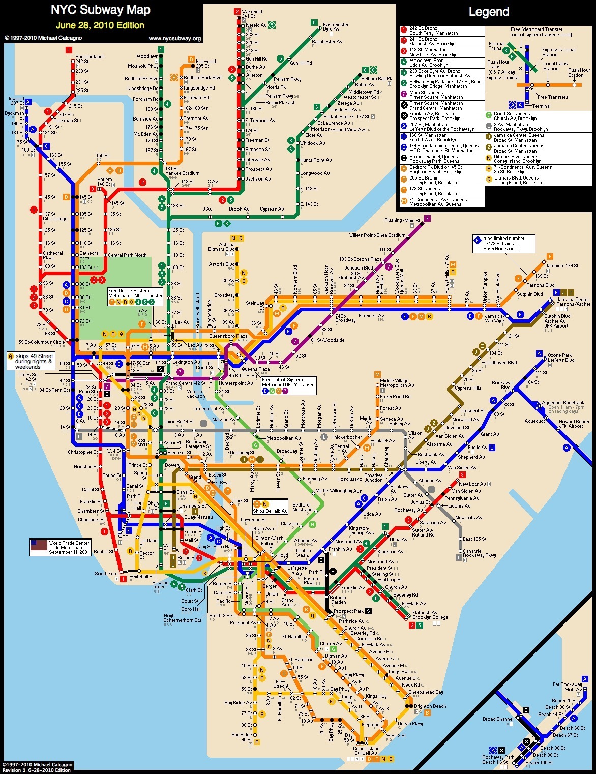
I decided to look at the London Underground after today's lecture, we picked up on it in the lecture and I found it really interesting  the way that the tube map is so iconic and is instantly recognisable. After looking at Harry Beck, the man who designed the tube map and how it has developed over the years, I decided to see how a map has been an inspiration for art work and also has been incorporates and used in other maps and underground networks all over the world, for example the Paris Metro uses a similar mapping system and so does the New York Subway, I will show these images below. The tube map was a map that was very easy to understand, this was because of the bold range of colours that were used to stand for each train line, your eyes are instantly drawn to which colour you needed when travelling to certain places, for example, the yellow line is Circle, blue is Victoria and red is Central, these are just a few of the lines. 

The London underground map was named one of the most iconic British design in a recent poll. The London Underground map, the Spitfire and Concorde have been voted Britain's three favourite designs of the last century. Design Museum visitors and viewers of BBC Two's The Culture Show were asked to choose from 25 design icons. Among them were the Routemaster bus, the Mini, red phone boxes and more recent inventions such as the world wide web and video game Tomb Raider. A public vote will decide which of the three is Britain's most iconic design. The London Underground map was designed by Harry Beck in 1931 when the Tube grew so large it became impossible to map the lines and stations geographically. [1]

The next thing I looked at was the front covers of the tube maps. In the last few years they have used artwork which is linked to the London Underground to illustrate the front covers of the map. All the art works are different and have different meanings.

One of the artworks was by Michael Landy was a drawing of the palm of a hand with different colour lines symbolising the different tube lines, I went onto the Transport for London's website and found this information about it,  the work is a tracing of the artist’s own hand in pencil; the creases and lines of the hand are represented by lines drawn in the various colours of the Tube map. In this way, Landy makes a direct relationship between ‘the artist’s hand’ and the Pocket Tube Map. We can read his palm and see how his personal journeys have left their mark there. Reproduced as a pocket artwork for millions of Tube travellers to hold in the palm of their own hands, the work has a humorous yet uncanny quality. Head of Art on the Underground, Tamsin Dillon, said: “I like the way that Landy brings us back to the physical workings of the Tube Map. His reference to the way that people write on their hands as an aid memoire is very much in contrast to current handheld technology – like GPS and Google Maps. The Pocket Tube Map is a traditional, ‘hands-on’ guide, which is still a great way to get around the London Underground system.” [2]

Another one which I looked at in more detail was one by Jeremy Deller,  He did a detailed drawing using colours which signify the London Underground train lines, the colours are subtle but still are recognisable to the tube. I looked on the Transport for London website again and found this,  Deller has been commissioned by Art on the Underground (the London Underground art programme) to create the next cover artwork for the London Underground Pocket Tube Map and has chosen to produce a delicate, line-drawn portrait of John Hough with artist Paul Ryan. As more and more elements of the Transport for London system are becoming digitised, the work reminds us of the thousands of people behind the scenes working on the ground to bring it to life. Portrait of John Hough is the latest in a line of commissions by Art on the Underground for the Pocket Tube Map cover. These have included works by some of Britain’s most exciting artists, including Yinka Shonibare, David Shrigley, Liam Gillick, Gary Hume and Emma Kay. Each artist is asked to respond to the challenge by following an informal set of rules, such as referring to the location of the work or incorporating the familiar colours and lines of the iconic London Underground map. [3]

[1]BBC. (2006). Top three 'iconic' designs named. Available: http://news.bbc.co.uk/1/hi/england/london/4769060.stm. Last accessed March 2013.

[2]Michael Landy. (2011). All my lines in the palm of your hand. Available: http://art.tfl.gov.uk/projects/detail/3581/. Last accessed 15th April 2013.

[3]Jeremy Deller. (2007). Portrait of John Hough. Available: http://art.tfl.gov.uk/projects/detail/1119/. Last accessed 15th April 2013.


Where I got my images,
http://www.aparisguide.com/maps/metro.gif
http://images.nycsubway.org/maps/calcagno-2010-06-28c.gif
http://now-here-this.timeout.com/wp-content/uploads/2012/06/Artwork-A-Z-Tube-map-poster-by-Tim-Fishlock-2010.jpg
http://art.tfl.gov.uk/file-uploads/large/pocket-tube-map-feb-06.jpg
http://art.tfl.gov.uk/file-uploads/large/barbara-kruger-tube-map-cover-.jpg
http://image.guardian.co.uk/sys-images/Arts/Arts_/Pictures/2008/01/09/corneliatube460jpg.jpg
http://art.tfl.gov.uk/file-uploads/large/jpeg--final.jpg
https://blogger.googleusercontent.com/img/b/R29vZ2xl/AVvXsEhC24c-D3ovvGKjfVSuMNAZIGxcosK9HQxldRDqpz4qWx4bN7vJRWlgd6pkZ-CEwfXm1yy6nfoUdtmhT4Xx4Zu4-B0tyIQ52I7ONXlyNOjYVB8zNypzLdZ6EYXmpd2qwuAEu__f9JiTyvUK/s1600/2006+2Tube-map-art-Yinka-Shonib-008.jpg
http://www.designweek.co.uk/Pictures/web/y/k/s/Tupe-Ma_468.jpg
http://art.tfl.gov.uk/file-uploads/large/pocket-map-cover.jpg